

GDP Per Capita
GDP per Capita is the sum of gross value added by all resident producers inthe economy, plus any product taxes, minus any subsidies not included in the value of the products, divided by the population. It is calculated without deductions for depreciation of fabricated assets or for depletion and degradation of natural resources. Data are made comparable across countries by converting GDP to international dollars using purchasing power parity (PPP) exchange rates.
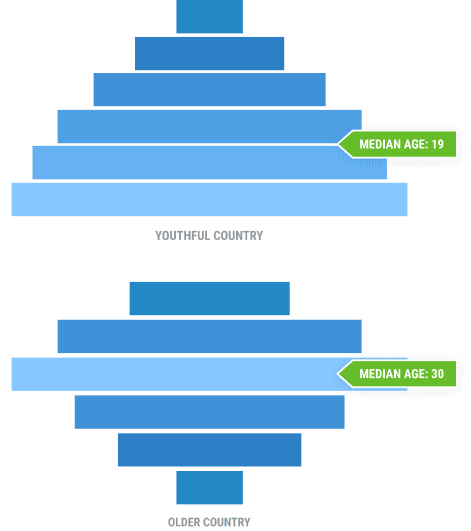
The quintiles probability line graph featuring the logistic regression analysis illustrates how a country’s probability of being in the top two quintiles of GDP per capita increases as median age increases. The threshold for having a 50% probability of being in the top two quintiles of GDP per capita is a median age of 30.
The scatterplot illustrates the relationship between median age and the logof GDP per capita in the countries included for analysis. The map allows users to visualize the geographic patterns behind country GDP per capita values.
The findings illustrate a statistically significant linear relationship: As the median age of the population increases, GDP per capita also tends to increase. Almost all countries with a median age less than 20 years have GDPs per capita less than $6,000. Examples of countries in this category include Tanzania and Uganda, with median ages of 17.9 years and 16.6 years, respectively. Conversely, almost all countries with median ages within the demographic window of opportunity (between ages 26 and 40) have GDPs per capita above $6,000. In countries where the median age has surpassed 30 years, the GDP per capita indicator often reaches $10,000 or above. An example is Brazil, with a median age of 33.1 and a GDP per capita of nearly $15,000. Only when countries reach a median ageof 40 years are they likely to attain a GDP per capita above $30,000. For instance, Japan and France both have a median age above 40 years and the GDP per capita is above $40,000. To illustrate the connection between median age and GDP per capita: No country with a median age less than 30 years has GDP per capita above $30,000, while no country with a median age of 30 or greater has a GDP per capita less than $8,000.
Source: World Bank, “GDP per Capita, PPP (constant 2017 international $),” World Bank Data.